

How to Choose Colours for a Sensory-Aware Home
Well… what a summer!
The school holidays have definitely kept me busy over the last couple of months. As well as juggling work with having the kids at home, we managed to squeeze in some camping, a trip to Italy and, because apparently we didn't have enough going on, we also moved house! It’s been lovely, but I’m not going to lie, I’m quite happy to see September arrive. The kids are now back at school, routines are slowly returning and I’m finally getting a little bit of breathing space to focus on work again.
There’s something I really love about September. It feels like a reset — a chance to get organised, rethink the spaces around us and make our homes feel a little more like us again. And one of the simplest ways we can change how a room feels is through colour. But when you're designing a home for a neurodivergent family, choosing colours isn't always just about what looks beautiful. Colour can influence how a space feels, and for some people, certain colours, tones and combinations can contribute to sensory overload or, conversely, help create a calmer environment.
So, with that in mind, this month I'm looking at how to choose colours for a sensory-aware home.
When most people think about colour in interior design, they think about style. Will it suit the room? Is it on trend? Will I still like it in five years? But when designing a sensory-aware home, colour can play a much bigger role than simply making a room look beautiful. For many neurodiverse individuals, including those with ADHD, Autism Spectrum Disorder (ASD), and Sensory Processing Disorder (SPD), the colours we surround ourselves with can contribute to how a space feels and functions. While colour alone won't transform a home, it can form an important part of creating inclusive spaces that support sensory regulation and reduce overwhelm and overstimulation.
There Is No Universal Colour Palette
One of the biggest myths surrounding Neurodivergent Interior Design is that there is a single colour palette that works for everyone. The reality is far more nuanced. Every individual experiences their environment differently. A colour that feels calming and comforting to one person may feel dull or uninspiring to another. Likewise, colours that energise one person may contribute to distraction or sensory overload for someone else. This is why creating sensory aware spaces should always start with understanding the people who live there rather than following a list of design rules.
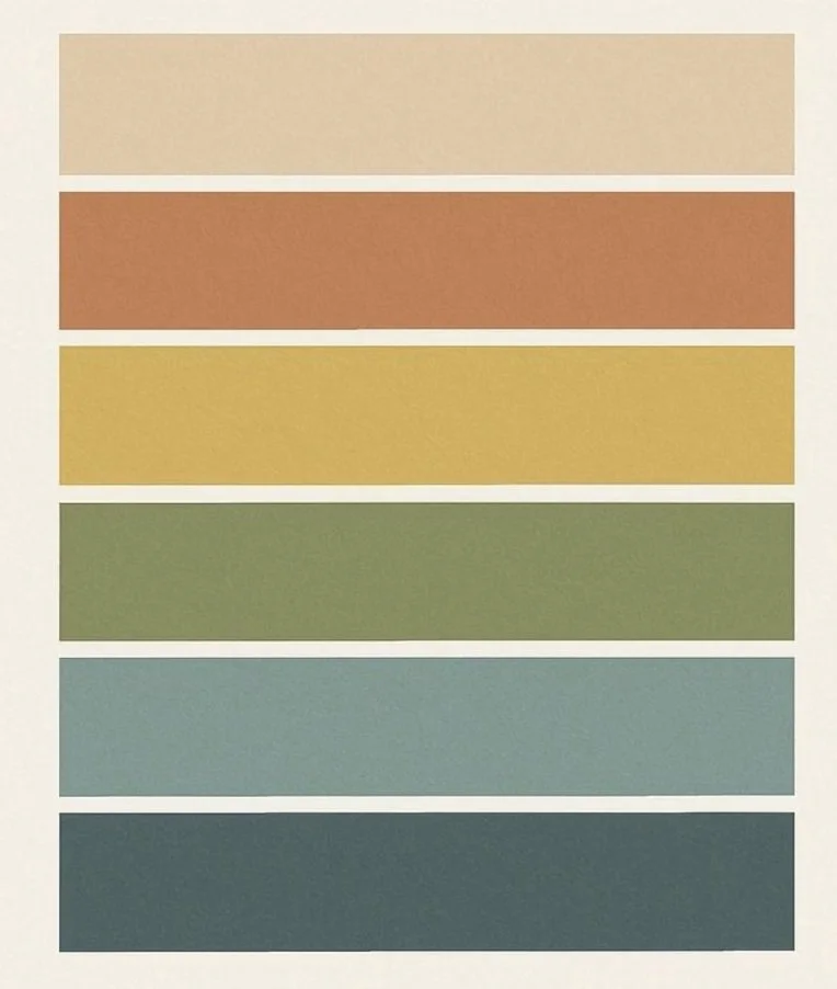
Colour palette
A Real-Life Example From Our Home
This is something I'm actually putting into practice at home at the moment. We’ve just moved house, and this weekend we’re decorating my son's new bedroom. He’s 9 and has ADHD, and the room he has inherited is currently yellow. It also had a yellow and grey geometric wallpaper feature wall, which we’ve already removed.
Rather than simply putting the wallpaper back up or choosing another colour because I like it, I'm thinking much more carefully about how I want his new room to feel and, more importantly, how it will work for him. Yellow is often described as a cheerful, energising colour, and there's absolutely nothing inherently wrong with using it in a bedroom. But knowing my son, and knowing that his bedroom needs to be somewhere he can wind down, sleep, get dressed and find his things, I'm keen to create a calmer and less visually stimulating environment.
Of course, I also want it to feel like his room. Sensory-aware design doesn't mean stripping away personality or creating a bland, neutral space. It's about finding the right balance between what works for the individual and what makes a room feel enjoyable and personal. So this weekend I'll be putting some of the ideas I talk about in this blog into practice in our own home — choosing colours, considering the lighting and thinking about the room as a whole rather than just picking a paint colour. I'll share more about his room as it comes together, including the colours and design choices we've made and, most importantly, how the finished space works for him. Because sometimes the best way to understand sensory-aware design is to see how those decisions work in a real home.
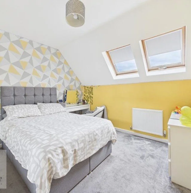
The before of my son’s room
Think About How You Want a Room to Feel
Rather than asking, "What colour should I paint this room?", I often encourage clients to think about how they want the room to feel. Should it feel restful? Focused? Comforting? Creative? The emotional experience of a room is often just as important as its appearance. When considering colour schemes, it's helpful to think about the activities that take place in the space and the needs of the people using it.
Colour Is Only One Piece of the Puzzle
A common mistake is focusing entirely on paint colours whilst overlooking everything else within the room.
In reality, colour interacts with many other elements, including:
Natural light
Artificial lighting
Furniture
Flooring
Patterns
Textures
Accessories
This is where thoughtful bespoke home design becomes so valuable. Looking at the room as a whole often produces better results than making decisions in isolation.
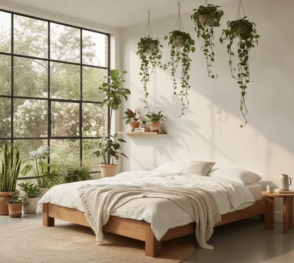
Natural light shining through
The Importance of Consistency
For some people, visual consistency throughout the home can help create a sense of calm and predictability. That doesn't mean every room needs to be painted the same colour, but carefully considered colour schemes can help spaces feel connected and easier to navigate. Combined with good spatial planning for homes and thoughtful furniture and layout planning, colour can help support a greater sense of flow throughout the home.
Designing for Diverse Needs
The most successful neurodivergent interior design projects don't begin with colour charts. They begin with people. Every family is unique, and every home should reflect the diverse needs of those living within it. Whether you're supporting someone with ADHD, Autism, sensory processing differences, or simply looking to create a calmer family home, thoughtful design should always respond to the individual rather than a set of assumptions. When colour is considered alongside layout, lighting, storage and sensory needs, it becomes a powerful tool for creating spaces that feel both beautiful and supportive.
If you'd like more practical guidance, don't forget to take a look at my ADHD and Autism Home Design Guides. They've been created to help you make confident design decisions and create a home that feels supportive, functional and tailored to your family's needs.
And if you'd like more personalised support, I'd love to help. Whether you need a fresh pair of eyes, a room redesign, or a complete interior design service, please get in touch.
You can contact me via email at sophielawsinteriors@outlook.com or visit www.sophielawsinteriors.co.uk to find out more.
I can't wait to help you make your space a happy, safe place!